

Mastering AI Change Management A GDEs Data Driven Playbook


Your state-of-the-art AI is failing for a reason that has nothing to do with the technology. The most sophisticated model on the planet is worthless if your employees won’t use it.

The Silent Killer of AI ROI: Low Employee Adoption
You’ve done the hard part. The data is clean, the models are trained, and the infrastructure is humming. You’ve deployed a state-of-the-art AI solution poised to revolutionize productivity, unlock new insights, and deliver a staggering return on investment. Then, silence. The dashboards show minimal usage. The revolutionary insights are gathering digital dust. The promised ROI remains a distant dream on a PowerPoint slide.
This scenario is the quiet, creeping failure that plagues countless AI initiatives. It’s not a catastrophic crash or a flawed algorithm; it’s the silent killer of AI ROI: low employee adoption. The most sophisticated AI on the planet is worthless if the people it’s designed to help don’t—or can’t—use it. Technology is only half the equation; the human element is the critical, and often overlooked, multiplier.
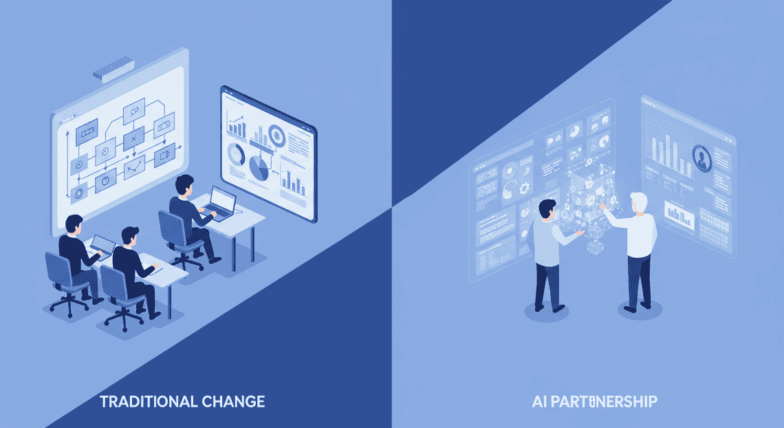
Why Traditional Change Management Falls Short in the AI Era
For decades, organizations have relied on established change management playbooks. Think town hall meetings, email blasts, and mandatory training sessions. These methods were designed for a different era of technological change—implementing a new CRM, migrating to the cloud, or adopting a new HR platform. These were largely deterministic changes: you learn a new process, click different buttons, and the system behaves predictably.
AI is a fundamentally different beast, and it breaks the traditional change management model in several key ways:
-
**From Process Change to Cognitive Shift: Traditional change management teaches people how to use a new tool. AI change management must teach people how to think alongside a new partner. AI doesn’t just change a workflow; it augments decision-making, challenges professional judgment, and redefines expertise. It requires a move from rote execution to critical supervision and creative collaboration with a non-human intelligence.
-
**The Trust Deficit: You don’t need to “trust” your spreadsheet in the same way you need to trust a generative AI model’s output or a predictive model’s forecast. AI is probabilistic, not deterministic. It can be a “black box,” making it difficult for users to understand why it produced a certain result. Without trust and a degree of explainability, users will revert to their old, comfortable, and fully transparent methods.
-
Continuous Evolution, Not a One-Time Switch: A traditional software rollout has a clear “go-live” date. AI models, however, are constantly being fine-tuned, updated, and retrained. The tool your team uses today might have new capabilities—and new quirks—next month. A “one-and-done” training event is obsolete before it even concludes. Change management must become an agile, continuous process of learning and adaptation, not a waterfall project.
-
Personal and Existential Impact: No one ever feared a new accounting software would make their entire profession irrelevant. With AI, these anxieties are real and pervasive. A generic communication plan that ignores fears about job security and the changing nature of work is not just ineffective; it’s tone-deaf and breeds resentment.
The True Cost of Failed AI Implementations
When an AI project fails due to poor adoption, the costs extend far beyond the initial investment in software and infrastructure. The fallout creates deep organizational scar tissue that can cripple future innovation.
-
Direct Financial Losses: This is the most obvious cost. It includes the sunk costs of software licenses, cloud compute resources, data science salaries, and consultant fees—all with nothing to show for it. It also includes the massive opportunity cost of the value you failed to capture, while your competitors who got adoption right are now operating more efficiently and making smarter decisions.
-
Erosion of Innovation Culture: When a high-profile AI initiative fizzles out, employees become cynical. The next time leadership announces an exciting new technology, the response isn’t enthusiasm but eye-rolls and skepticism. This “change fatigue” creates a powerful inertia that makes every subsequent transformation initiative exponentially harder to execute.
-
Productivity Paradox: Instead of the promised efficiency gains, you get a productivity trough. Employees either ignore the new tool and cling to less efficient legacy workflows or, even worse, spend more time trying to work around the poorly integrated AI than they would have spent on the original task.
-
The Vicious Cycle of Data Starvation: Many AI systems, especially those using reinforcement learning or human-in-the-loop processes, are designed to improve with user interaction. When adoption is low, the model is starved of the very feedback data it needs to get smarter and more useful. The tool’s mediocre performance justifies the team’s decision not to use it, which in turn ensures the tool never improves, creating a death spiral of mediocrity.
Shifting from Top-Down Mandates to Data-Informed Strategies
The classic top-down mandate—“We’ve built this, you will now use it, attend the mandatory training”—is the surest path to failure in the AI era. It treats employees as passive subjects to be managed, rather than active partners in a transformation.
A modern, data-driven approach flips the script. It treats AI adoption not as a communications problem, but as an internal product management challenge. The goal is to create an AI tool that people want to use because it demonstrably makes their work better, easier, and more valuable.
This requires a fundamental shift from broadcasting mandates to gathering intelligence:
-
Start with Qualitative Data: Before and during a pilot, use surveys, 1-on-1 interviews, and focus groups to map the human terrain. Don’t ask, “Are you excited about AI?” Ask, “What is the most tedious, repetitive part of your day?” or “If you had a magic wand, what information would help you make better decisions?” This uncovers real pain points and ensures you’re solving a problem people actually have. It also helps you understand their fears and anxieties, allowing you to address them proactively.
-
Leverage Quantitative Usage Data: Instrument your AI tools to understand behavior at scale. This isn’t about surveillance; it’s about diagnostics. Where in the workflow are users dropping off? Which features are they ignoring? Are there “power users” emerging whose behavior you can study and replicate? This data provides objective insights into friction points and successes, guiding your training and development efforts.
-
Measure Performance and Outcomes: The ultimate proof is in the results. Run A/B tests or compare the performance of pilot groups against control groups. Does the team using the AI tool resolve customer tickets 15% faster? Do the sales reps using the AI-powered lead scorer have a higher conversion rate? This hard data moves the conversation from “You should use this” to “Look at the incredible results this team is achieving.” It builds a pull for adoption based on proven value, not corporate authority.
By combining qualitative understanding, quantitative analytics, and performance metrics, you transform change management from a one-way street into a continuous, evidence-based feedback loop. You stop guessing what employees need and start building solutions based on what the data tells you they value.
A GDEs Framework for Data-Driven Transformation
Theory is essential, but execution is what separates a successful AI integration from a failed one. To move from abstract principles to tangible results, you need a robust, repeatable framework. This isn’t about buying another expensive, proprietary change management platform. It’s about leveraging the powerful, interconnected tools you likely already have access to, augmented with a proven methodology for managing human adaptation.
This framework is designed to be a pragmatic, scalable system for capturing, analyzing, and acting on the human-centric data that truly dictates the success of any technological shift. We’ll turn anecdotal feedback into structured metrics and gut feelings into data-backed interventions.
Introducing the Core Tech Stack Sheets Gemini Docs and Looker
The power of this framework lies in its simplicity and the seamless integration of its components. We’re creating a data pipeline specifically for change management, using three pillars of the [Automatically create new folders in Google Drive, generate templates in new folders, fill out text automatically in new files, and save info in [Automated Web Scraping with [Multilingual Text-to-Speech Tool with SocialSheet Streamline Your Social Media Posting 123](https://votuduc.com/Multilingual-Text-to-Speech-Tool-with-Google-Workspace-p809282)](https://votuduc.com/Automated-Web-Scraping-with-Google-Sheets-p292968)](https://workspace.google.com/marketplace/app/auto_create_folder_and_files/430076014869) and Cloud ecosystem.
- Google Sheets: The Universal Data Hub
Think of Sheets as your foundational layer—the single source of truth for all quantitative and qualitative change data. Its universal accessibility and collaborative nature make it the perfect tool for decentralized data collection. This is where you’ll aggregate everything: survey responses from Google Forms, training completion rates exported from your LMS, pilot group usage logs, and sentiment scores. It’s the structured repository that feeds the rest of our system.
- Gemini & Google Docs: The AI-Powered Synthesis Engine
This is where the magic happens. Raw data, especially unstructured text, is often the richest source of insight but the hardest to analyze at scale. Gemini, integrated directly into the AC2F Streamline Your Google Drive Workflow, becomes your AI-powered qualitative analyst.
-
In Docs: Paste raw transcripts from feedback sessions or “Ask Me Anything” meetings. Prompt Gemini to perform a thematic analysis, identify the top three concerns, summarize key questions, and gauge the overall sentiment.
-
In Sheets: Use the Gemini for Sheets extension to analyze thousands of open-ended survey comments in seconds. You can ask it to categorize feedback into buckets like “Training Gaps,” “Workflow Concerns,” or “Positive Outlook,” and even generate a concise summary for each category. This transforms a wall of text into a structured, quantifiable dataset.
-
Looker / Looker Studio: The Strategic Command Center
If Sheets is the database and Gemini is the analyst, Looker (or the highly accessible Looker Studio) is your executive dashboard. By connecting directly to your master Google Sheet, Looker transforms your processed data into a dynamic, real-time view of your change initiative’s health. You’re no longer looking at static spreadsheets; you’re interacting with a strategic command center that visualizes trends over time, allows stakeholders to drill down into specific team data, and tracks progress against your key performance indicators for change adoption.
Anchoring Your Strategy in the ADKAR Model
Technology without a methodology is just a collection of tools. To give our data-driven framework purpose and direction, we anchor it in the Prosci ADKAR® Model—a simple yet powerful model for understanding the stages of individual change. We’ll use our tech stack to measure and influence each stage:
-
Awareness of the need for change.
-
Measurement: Use Sheets to track webinar attendance, email open rates on announcement comms, and views on informational videos.
-
Insight: Use Gemini in Docs to analyze Q&A transcripts from town halls to see if the “why” behind the change is landing correctly. Are people asking logistical questions (a good sign) or fundamental “why are we doing this” questions (a red flag)?
-
Desire to participate and support the change.
-
Measurement: Deploy pulse surveys via Google Forms, feeding directly into Sheets. Ask questions that rate motivation and support on a 1-5 scale.
-
Insight: Use Gemini in Sheets to perform [How to build a Custom Sentiment Analysis System for Operations Feedback Using Google Forms OSD App Clinical Trial Management and [Building Self Correcting Agentic Workflows with Building Self-Correcting Agentic Workflows with Vertex AI](https://votuduc.com/building-self-correcting-agentic-workflows-with-vertex-ai-p-20260321542526)](https://votuduc.com/How-to-build-a-Custom-Sentiment-Analysis-System-for-Operations-Feedback-Using-Google-Forms-AppSheet-and-Vertex-AI-p428528) on open-ended comments related to desire. This helps you pinpoint the root cause of resistance—is it fear of job loss, skepticism about the benefits, or frustration with past changes?
-
Knowledge on how to change.
-
Measurement: Track training module completion rates and assessment scores in your master Sheet.
-
Insight: If knowledge scores are low, is it universal, or is it concentrated in a specific department? Your Looker dashboard will make these patterns immediately obvious.
-
Ability to implement required skills and behaviors.
-
Measurement: Log post-training support ticket volumes, track the adoption of new features via usage analytics, and collect manager observations—all in Sheets.
-
Insight: Use Gemini to analyze support ticket text to find recurring themes. If dozens of tickets mention confusion around a specific step in a new workflow, you have a clear indicator that knowledge hasn’t translated to ability.
-
Reinforcement to sustain the change.
-
Measurement: Use Looker to visualize long-term adoption metrics, performance improvements, and success stories. Track proficiency scores over months, not just days.
-
Insight: Create a “Change Champions” leaderboard in your Looker dashboard to publicly recognize and reinforce the new behaviors, using data from Sheets to identify top performers.
The Goal From Raw Engagement Data to Actionable Change Plans
The ultimate purpose of this framework is to close the loop between insight and action. A beautiful dashboard is useless if it doesn’t drive intervention. Our goal is to create a clear, traceable path from a single data point to a specific, targeted change management activity.
The flow is simple but powerful:
-
Raw Data: A project manager submits notes from a focus group into a Google Doc.
-
AI Synthesis: Gemini analyzes the notes, identifying a strong theme of anxiety from the marketing team about the AI tool’s impact on their creative process. It assigns a negative sentiment score.
-
Data Aggregation: This synthesized insight is logged in the master Google Sheet, tagged to the “Marketing” department and the “Desire” ADKAR stage.
-
Strategic Visualization: The Looker dashboard automatically updates. A key metric, “Team Desire Score,” turns from green to yellow for the marketing department, triggering an alert.
-
Actionable Plan: Seeing this data, the Change Management lead doesn’t have to guess. They can formulate a precise action plan: “Schedule a hands-on workshop specifically for the marketing team, co-hosted by a creative lead from a team that has already successfully adopted the tool. The goal is to demonstrate how the AI augments creativity, not replaces it.”
This is the endgame: transforming your change management practice from a reactive, checklist-driven function into a proactive, data-driven strategic partner. You’re not just managing change; you’re precisely steering it.
Step 1 Collecting and Structuring User Engagement Data
You can’t manage what you don’t measure. This old adage is the bedrock of our data-driven playbook. Before you can understand adoption friction, celebrate wins, or iterate on your rollout strategy, you need a reliable stream of data. This initial step is about laying the foundational plumbing: defining what to track, creating a simple system to capture it, and doing so in a way that respects user privacy and builds trust. Getting this right makes every subsequent step exponentially more effective.
Identifying Key Adoption Metrics in Your AI Tools
The first temptation is to track everything. Resist it. Drowning in data is just as bad as having none. Instead, focus on a handful of key metrics that directly reflect your change management goals. Think less about “vanity metrics” (e.g., total API calls) and more about “actionable metrics” that reveal user behavior patterns.
A useful framework for internal tools is A-E-R-I (Adoption, Engagement, Retention, Impact):
-
Adoption: Are people trying the tool? This is your top-of-funnel metric.
-
Examples: Unique users per day/week, count of first-time users, percentage of invited users who have logged in at least once.
-
Engagement: Are they using it meaningfully, not just kicking the tires?
-
Examples: Number of prompts/queries per active user, usage of specific high-value features (e.g., “generate code snippet” vs. “ask general question”), average session length.
-
Retention: Are they coming back? This is the strongest signal of perceived value.
-
Examples: Daily Active Users (DAU) / Weekly Active Users (WAU), cohort retention (e.g., “Of the users who signed up in week 1, what percentage were still active in week 4?”).
-
Impact: Is the tool actually helping them do their jobs better? This can be harder to quantify but is ultimately the most important.
-
Examples: Self-reported time saved (via occasional micro-surveys), reduction in support tickets for related topics, number of “accepted” AI suggestions in a code editor.
**Pro-Tip: Define these metrics before you write a single line of tracking code. For a new AI-powered document summarizer, your key metrics might be: (1) Unique users summarizing a doc per week, (2) Average number of summaries per active user, and (3) 2-week retention rate. Start simple, and earn the right to add complexity later.
Using Google Sheets and Apps Script as a Centralized Log Hub
You don’t need a complex data warehouse to get started. For many internal AI tool rollouts, a combination of Google Sheets and [AI Powered Cover Letter [Automated Job Creation in Real Time Jobber and Google Sheets Integration from Gmail](https://votuduc.com/Automated-Job-Creation-in-Jobber-from-Gmail-p115606) Engine](https://votuduc.com/AI-Powered-Cover-Letter-Automated Quote Generation and Delivery System for Jobber-Engine-p111092) provides a surprisingly robust, scalable, and cost-effective solution for centralized logging.
Here’s the architecture: Your AI tool (whether it’s a custom web app, a Slack bot, or a browser extension) sends an event payload via an HTTP POST request to a deployed Apps Script Web App URL. The script then parses this payload and appends it as a new row in a designated Google Sheet.
The Process:
-
Create a Google Sheet: This will be your database. Create a new sheet and define your columns. For example:
timestamp,event_type,user_id,session_id,metadata. -
Create a Bound Apps Script: From your Sheet, go to
Extensions > Apps Script. -
Write the
doPostfunction: This function is the heart of your logging endpoint. It automatically executes whenever your Web App URL receives a POST request.
Here is a boilerplate doPost(e) function to get you started.
// Set the name of the sheet where you want to log data.

const LOG_SHEET_NAME = "Event Logs";

// This function runs when the Web App receives an HTTP POST request.

function doPost(e) {

try {

// Get the active spreadsheet and the specific log sheet.

const ss = SpreadsheetApp.getActiveSpreadsheet();

const sheet = ss.getSheetByName(LOG_SHEET_NAME);

// If the sheet doesn't exist, throw an error.

if (!sheet) {

throw new Error(`Sheet with name "${LOG_SHEET_NAME}" not found.`);

}

// Parse the JSON payload from the request body.

const eventData = JSON.parse(e.postData.contents);

// Create a timestamp for the event.

const timestamp = new Date();

// Define the order of columns in your spreadsheet.

// This ensures data is always inserted correctly.

const rowData = [

timestamp,

eventData.eventType || 'N/A',

eventData.userId || 'N/A',

eventData.sessionId || 'N/A',

// Stringify any extra metadata for flexible logging.

JSON.stringify(eventData.metadata || {})

];

// Append the data as a new row to the sheet.

sheet.appendRow(rowData);

// Return a success response to the client.

return ContentService

.createTextOutput(JSON.stringify({ "status": "success" }))

.setMimeType(ContentService.MimeType.JSON);

} catch (error) {

// If an error occurs, log it for debugging and return an error response.

console.error("Error in doPost:", error);

return ContentService

.createTextOutput(JSON.stringify({ "status": "error", "message": error.message }))

.setMimeType(ContentService.MimeType.JSON);

}

}
- Deploy as a Web App: In the Apps Script editor, click
Deploy > New deployment.
-
Select
Web appas the type. -
In the configuration, set
Execute astoMe.
Crucially, set Who has access to Anyone. This does* not mean anyone can see your sheet; it only means any service can send data to your script endpoint. The underlying sheet remains private.
- Copy the generated Web App URL. This is your logging endpoint.
Now, from your AI application, you can send a POST request with a JSON body like this to your new URL:
{

"eventType": "prompt_submitted",

"userId": "a8e3b0c1-f2d4-4e56-8a9b-7c8d9e0f1a2b",

"sessionId": "sess_xyz789",

"metadata": {

"promptLength": 127,

"modelUsed": "gemini-1.5-pro-latest"

}

}
This simple, serverless setup is perfect for collecting raw data that you can later analyze and visualize in tools like Looker Studio.
Best Practices for Data Anonymization and Privacy
Collecting user data, even for internal tools, is a significant responsibility. Your goal is to understand usage patterns, not to monitor individuals. Building user trust is a non-negotiable part of successful change management. If users feel like they’re being spied on, they will actively avoid your new tool.
-
**Embrace Pseudonymization: You rarely need to know who a user is, but you often need to know that it’s the same user over time to calculate retention and engagement. Instead of logging PII like emails or names, use a stable, non-identifiable pseudonym. A hashed version of their user ID or a randomly generated UUID assigned at first login works perfectly. In the example above,
a8e3b0c1-f2d4-4e56-8a9b-7c8d9e0f1a2bis a great pseudonymous identifier. -
**Collect the Minimum Viable Data: Never log sensitive information from user prompts or the AI’s responses. Your goal is to log the metadata about the interaction, not the interaction itself. Instead of logging
prompt: "Draft a confidential performance review for John Doe", log{"promptLength": 55, "topic": "HR"}. This gives you the analytical insight you need without creating a privacy liability. -
Control Access Tightly: The raw data in your Google Sheet should only be accessible to a very small number of administrators responsible for the project. For everyone else—stakeholders, managers, team leads—share aggregated data and visualizations through a Looker Studio dashboard. This enforces a clean separation between raw logs and business insights.
-
Be Transparent: Communicate openly with your users about what you are tracking and why. A short, clear notice within the tool (e.g., “To help improve this tool, we collect anonymized usage data like feature clicks and session duration. We never log the content of your prompts.”) can preemptively address concerns and build confidence in the project.
Step 2 Analyzing Adoption Barriers with Gemini Enterprise
Once you’ve instrumented your AI tools and gathered the initial data, you’re sitting on a potential goldmine of insights. But raw data—be it usage logs, survey free-text, or support channel chatter—is just noise. The challenge is to find the signal. This is where a multimodal, large-context model like Gemini Enterprise becomes your primary analytical engine. We’re moving beyond simple dashboards and metrics to understand the why behind user behavior, and we’re going to do it at scale.
Crafting Effective Prompts to Uncover Root Causes
The quality of your analysis is directly proportional to the quality of your prompts. A vague question yields a vague answer. To uncover the deep-seated root causes of low adoption, you need to prompt Gemini with the precision of a seasoned researcher. A powerful prompt typically includes four key elements: Persona, Context, Task, and Format (PCTF).
-
Persona: Tell the model who it should be. “Act as a senior change management consultant specializing in enterprise AI deployments.”
-
Context: Provide the necessary background. Describe the AI tool, its intended purpose, the target user group, and the data you are providing for analysis.
-
Task: Clearly define what you want the model to do. Be specific. Instead of “analyze this data,” use “Identify the top 3-5 root causes for low user adoption based on the provided feedback. Distinguish between technical issues, knowledge gaps, and workflow friction.”
-
Format: Specify the output structure. This is crucial for consistency and downstream processing. Requesting a Markdown table, JSON object, or a bulleted list makes the output immediately usable.
Let’s imagine we’ve deployed a new AI-powered “Internal Knowledge Bot” and adoption is lagging. We’ve collected feedback from a survey and messages from the #ask-the-bot support channel.
Here’s how you could structure a prompt to get to the heart of the matter:
Act as a principal change management analyst. Your goal is to identify the root causes of low adoption for our new "Internal Knowledge Bot," which is designed to help engineers find documentation and code snippets quickly.

**Context:**

The bot was launched two weeks ago to all 500 engineers. It integrates with Slack. The provided data below contains anonymized user feedback from a pop-up survey and messages from our internal support channel.

**Task:**

Analyze the following user feedback snippets. Synthesize the information to identify the top 3 root causes for poor adoption. For each root cause, provide:

1.  A clear, concise name for the root cause (e.g., "Inaccurate Search Results").

2.  A brief explanation of the issue.

3.  A representative user quote from the data that exemplifies the problem.

4.  Classify the root cause as either 'Technical Issue', 'Knowledge Gap', or 'Workflow Friction'.

**Data:**

[

{"source": "survey", "feedback": "I tried asking it for the latest deployment checklist, but it gave me a version from last year. I can't trust it."},

{"source": "slack", "feedback": "how do i even use this thing? i type a question and it just says 'rephrasing your query'. not helpful."},

{"source": "survey", "feedback": "It's faster for me to just ask my teammate Dave than to try and figure out the right keywords to get the bot to understand me."},

{"source": "slack", "feedback": "The bot is so slow to respond. I typed a query and waited 30 seconds. I could have found it myself by then."},

{"source": "survey", "feedback": "I wish I knew what kinds of questions it's good at. Is it for code? for HR policy? I don't know where to start."}

]

**Format:**

Return your analysis as a Markdown table with the columns: "Root Cause", "Explanation", "Example Quote", and "Classification".
This structured approach transforms the model from a simple text generator into a powerful analytical partner, guiding it to produce actionable, well-organized insights.
From Raw Logs to Thematic Analysis of User Behavior
Your data will come in two flavors: structured (e.g., usage logs, event counts) and unstructured (e.g., chat logs, survey responses, support tickets). While structured data tells you what is happening, unstructured data tells you why. Manually sifting through thousands of comments is impossible. Gemini Enterprise excels at performing thematic analysis on vast quantities of unstructured text.
The process involves feeding batches of raw, unstructured data to the model with a prompt designed to categorize and theme the content. This is where the large context window of models like Gemini 1.5 Pro is a game-changer, allowing you to analyze entire conversations or large documents in a single prompt.
Imagine you have a CSV export of 5,000 free-text survey responses. Using a JSON-to-Video Automated Rendering Engine script with the Vertex AI SDK, you can iterate through the responses and ask Gemini to classify each one.
Here’s a prompt designed for this kind of thematic categorization:
You are a data analysis service. Your task is to perform thematic analysis on the provided user feedback about our new "AI Code Assistant" tool.

For the user comment below, classify it into one or more of the following themes:

- **Performance:** Comments related to speed, latency, or resource consumption.

- **Accuracy:** Comments about the correctness or relevance of AI suggestions.

- **Usability:** Comments about the user interface, ease of use, or integration with the IDE.

- **Onboarding:** Comments expressing confusion about how to get started or use features.

- **Value_Proposition:** Comments questioning the tool's usefulness or comparing it to existing workflows.

- **Feature_Request:** Comments suggesting new functionality.

**User Comment:**

"The code suggestions are sometimes way off and don't match our internal coding standards. It also makes my IDE feel sluggish, especially when opening large files. I turned it off because it was getting in my way more than it was helping."

**Format:**

Return your output as a JSON object with a key "themes" containing a list of the identified theme strings. For example: {"themes": ["Performance", "Accuracy"]}
By running this process over your entire dataset, you can instantly transform thousands of individual comments into a quantifiable breakdown of user sentiment. You might discover that 40% of negative feedback relates to “Performance,” while only 10% is about “Onboarding.” This immediately tells you where to focus your efforts: fixing performance issues will have a much greater impact than rewriting your tutorials.
Pinpointing Resistance Points and Knowledge Gaps with AI
With your data now thematically categorized, you can use Gemini for a final, more nuanced layer of analysis: distinguishing between resistance points and knowledge gaps. This distinction is critical for designing effective interventions.
-
**Knowledge Gaps: These are informational problems. Users don’t know how to use the tool or are unaware of its full capabilities. The solution is education: better documentation, tutorials, workshops, and targeted tips.
-
**Resistance Points: These are workflow, trust, or value-based problems. Users know how to use the tool but choose not to. They may feel it’s slower than their current method, they don’t trust its output, or it disrupts their ingrained habits. The solution here is more complex, involving tool improvements, demonstrating value, and addressing user concerns directly.
You can craft a prompt that takes the themes you’ve already identified and asks Gemini to perform this classification.
Act as an organizational psychologist analyzing employee adoption of a new AI tool.

Based on the provided theme and representative user quotes, classify the core issue as either a "Knowledge Gap" or a "Resistance Point".

Provide a brief rationale for your classification.

**Theme:** Usability

**User Quotes:**

- "I can't figure out where the settings are to customize the suggestions."

- "The pop-up is so intrusive, it constantly breaks my coding flow. I had to disable it."

- "How do I get it to ignore my test files? It keeps trying to autocomplete my mock data."

**Format:**

Return a JSON object with two keys: "classification" (either "Knowledge Gap" or "Resistance Point") and "rationale".
In this example, Gemini would likely identify that while some quotes point to a Knowledge Gap (“where are the settings?”, “how do I ignore files?”), the quote about the intrusive pop-up breaking a user’s flow is a clear Resistance Point. It’s not that the user doesn’t know how it works; it’s that the way it works is actively detrimental to their established process.
This AI-powered analysis moves you from a vague understanding of “user dissatisfaction” to a precise, prioritized list of knowledge gaps to fill and resistance points to overcome. This data-driven clarity is the foundation of an effective change management strategy.
Step 3 Automating ADKAR Plans with Gemini and Google Docs
Once Gemini has processed your qualitative and quantitative data, you’re left with a rich tapestry of insights. But raw insight, however profound, doesn’t drive change. The next critical step is to translate this analysis into a structured, actionable change management plan. This is where we bridge the gap between data science and human-centric change leadership by operationalizing the ADKAR model at scale, using Gemini as our co-strategist and Google Docs as our canvas.
Translating Gemini’s Analysis into ADKAR Components
The beauty of the ADKAR model lies in its sequential, human-focused structure. Gemini’s analytical prowess can be precisely mapped to each of these components, transforming abstract data points into a coherent change narrative. The key is to craft prompts that specifically ask Gemini to categorize its findings within this framework.
Here’s how the translation works:
-
**Awareness (of the need for change): Gemini can analyze survey responses, town hall Q&A transcripts, and team chat logs to pinpoint knowledge gaps. By prompting it to identify the most common questions or misconceptions about the “why” behind the change, you can generate a data-backed list of communication priorities. The output directly informs your Awareness campaign, ensuring you address what people are actually asking, not what you assume they are.
-
Desire (to participate and support the change): This is where sentiment analysis shines. Gemini can parse open-ended feedback, focus group notes, and even anonymous comments to identify pockets of resistance and enthusiasm. You can prompt it to summarize the primary drivers of resistance (e.g., “fear of job redundancy,” “perceived increase in workload”) and the key motivators for early adopters. This allows you to create targeted interventions to address barriers and amplify positive sentiment.
-
Knowledge (on how to change): By analyzing help desk tickets, training feedback, and support channel conversations, Gemini can identify specific knowledge gaps. A prompt like, “Based on these support tickets, what are the top five areas of confusion regarding the new software?” provides an instant, prioritized list for your training team. This moves you from generic training modules to surgical, needs-based educational content.
-
Ability (to implement required skills and behaviors): Knowledge isn’t the same as ability. Gemini can help bridge this by analyzing post-training performance data, sandbox usage logs, or peer review feedback. It can identify patterns where users understand the “what” but struggle with the “how.” This insight allows you to design hands-on workshops, create targeted job aids, or implement coaching programs focused on practical application.
-
Reinforcement (to sustain the change): How do you make the change stick? Gemini can track adoption metrics over time, analyze feedback on the new process, and identify “positive deviants”—power users whose behaviors can be modeled. It can also analyze feedback on reward and recognition programs to see what’s truly motivating people. This data provides a feedback loop to refine your reinforcement strategy and celebrate meaningful wins.
Generating Personalized Change Management Plans at Scale
The most significant limitation of traditional change management is its one-size-fits-all approach. An engineer’s journey through change is vastly different from that of a sales executive. AI-powered Automated Work Order Processing for UPS shatters this limitation.
The goal is to move from a single, monolithic ADKAR plan to a portfolio of personalized plans tailored to the unique context of each department, role, or persona. This is achieved by creating a repeatable workflow:
-
Define Personas: Identify the key stakeholder groups impacted by the change (e.g., Frontend Engineers, Sales Directors, Customer Support Agents).
-
Create a Template: Design a Google Doc template for your ADKAR plan. This document contains the standard structure (Awareness, Desire, etc.) but uses placeholders for the specific findings and recommended actions, like
{{DEPARTMENT_NAME}}or{{AWARENESS_COMMUNICATION_POINTS}}. -
Develop a Master Prompt: Craft a sophisticated Gemini prompt that accepts a persona or department as an input variable. This prompt instructs the model to filter its analysis for that specific group and structure its output according to the ADKAR framework.
-
Automate with Genesis Engine AI Powered Content to Video Production Pipeline: A simple script can orchestrate the entire process. It iterates through your list of personas, calls the Gemini API with the tailored prompt for each, parses the structured response (e.g., JSON), and then uses the Google Docs API to create a new document from your template, populating it with the personalized insights.
The result? In minutes, you can generate dozens of context-aware, data-driven change plans, freeing up change managers to focus on high-value human interaction rather than manual document creation.
A Sample Workflow from Insight to Documented Strategy
Let’s make this concrete. Imagine we’re rolling out a new AI-powered code review assistant, “CodeGuardian,” to our engineering organization. We’ve already collected survey data and feedback from a pilot program.
Step 1: The Master Prompt for the “Backend Engineering Team”
We use a detailed prompt that tells Gemini exactly what we need.
ROLE: You are a Change Management Strategist.

TASK: Analyze the provided dataset (survey results, pilot feedback, chat logs) about the "CodeGuardian" implementation. Generate a structured ADKAR change management plan specifically for the "Backend Engineering Team".

FORMAT: Your output MUST be in a structured JSON format. For each ADKAR element, provide:

1. "key_findings": A bulleted list of the 2-3 most critical insights from the data relevant to this team.

2. "recommended_actions": A bulleted list of 2-3 specific, actionable recommendations to address the findings.

DATA CONTEXT: The dataset contains feedback from multiple teams. Filter your analysis to focus only on comments and data explicitly from or about the Backend Engineering Team.

JSON STRUCTURE:

{

"target_group": "Backend Engineering Team",

"adkar_plan": {

"awareness": {

"key_findings": [],

"recommended_actions": []

},

"desire": {

"key_findings": [],

"recommended_actions": []

},

"knowledge": {

"key_findings": [],

"recommended_actions": []

},

"ability": {

"key_findings": [],

"recommended_actions": []

},

"reinforcement": {

"key_findings": [],

"recommended_actions": []

}

}

}
Step 2: Gemini’s Structured JSON Output
After processing the data, Gemini returns a clean JSON object, ready for automation.
{

"target_group": "Backend Engineering Team",

"adkar_plan": {

"awareness": {

"key_findings": [

"75% of the team is unaware that CodeGuardian can be configured to ignore legacy microservices, a key concern.",

"There is a common misconception that CodeGuardian will replace peer reviews entirely, rather than augment them."

],

"recommended_actions": [

"Host a dedicated demo for the Backend team focusing on the configuration and customization features.",

"Publish a one-page FAQ addressing the 'human-in-the-loop' role and how CodeGuardian complements, not replaces, peer review."

]

},

"desire": {

"key_findings": [

"Senior engineers express concern that the tool will slow down their workflow with 'nitpicky' suggestions.",

"Junior engineers are enthusiastic about the learning potential but fear negative performance metrics from AI-flagged issues."

],

"recommended_actions": [

"Showcase a testimonial from a senior engineer in the pilot who saw a 15% reduction in CI/CD pipeline failures.",

"Clarify in all communications that CodeGuardian metrics are for learning and quality improvement, not individual performance evaluation."

]

},

"knowledge": {

"key_findings": [

"Users struggle with interpreting the 'Security Vulnerability Prediction' score.",

"Most engineers do not know how to integrate CodeGuardian feedback directly into their IDE."

],

"recommended_actions": [

"Create a short video tutorial explaining the security scoring model with concrete examples.",

"Provide code snippets and setup guides for VS Code and JetBrains IDE integration."

]

},

"ability": {

"key_findings": [

"Engineers know how to accept/reject suggestions but are not effectively using the 'snooze for this file' feature, leading to frustration.",

"In practice, engineers are not using the tool to proactively refactor code, only to fix errors."

],

"recommended_actions": [

"Run a 'Tips & Tricks' brown bag session focused on advanced workflow features.",

"Introduce a 'Refactor Friday' initiative, encouraging teams to use CodeGuardian to identify and tackle a piece of tech debt."

]

},

"reinforcement": {

"key_findings": [

"Early adopters feel their feedback is not being heard or acted upon.",

"There is no visible recognition for teams who are effectively using the tool to improve code quality."

],

"recommended_actions": [

"Create a dedicated Slack channel #codeguardian-feedback and ensure prompt responses from the dev team.",

"In the monthly Engineering All-Hands, feature a 'Code Quality Win of the Month' based on CodeGuardian metrics and team nominations."

]

}

}

}
Step 3: Automation Creates the Document
A [Architecting Multi Tenant AI Workflows in Building Modular Agentic Apps Script with Gemini Function Calling](https://votuduc.com/architecting-multi-tenant-ai-workflows-in-google-apps-script-p-20260321290501) is triggered. It:
-
Copies the “ADKAR Plan Template.gdoc”.
-
Renames it to “CodeGuardian ADKAR Plan - Backend Engineering.gdoc”.
-
Parses the JSON output from Gemini.
-
Finds and replaces placeholders in the document.
{{AWARENESS_FINDINGS}}is replaced with the corresponding bullet points from the JSON. -
Saves the final document in a shared Google Drive folder.
This workflow transforms a multi-day manual process of analysis and documentation into an automated, repeatable function. It delivers a data-driven, highly relevant, and actionable change plan directly into the hands of the people who need it, allowing your organization to manage change with unprecedented precision and speed.
Step 4: Visualizing Progress and Impact with Looker Studio
Data sitting in a BigQuery table is potential energy. To turn it into kinetic energy—the force that drives change—you need to visualize it. Raw numbers are hard to interpret; stories are compelling. This is where Looker Studio (formerly Google Data Studio) becomes your change management command center. By connecting directly to our BigQuery data sources, we can build a dynamic, real-time dashboard that translates complex adoption metrics into clear, actionable insights for every level of the organization.
Forget static weekly reports and manually updated spreadsheets. We’re building a living instrument panel for our AI initiative.
Building a Real-Time AI Adoption Dashboard for Leadership
Leadership needs a high-level, “at-a-glance” view. They don’t have time to sift through raw data; they need the bottom line, fast. Your primary leadership dashboard should be clean, focused, and answer their key questions: “Are we on track?” and “What is the impact?”
Here are the essential components for your executive dashboard:
- Headline KPIs (Key Performance Indicators): Use Scorecard charts to display the most critical numbers at the top.
-
Overall Adoption Rate: The percentage of the target audience actively using the new AI tool.
-
ADKAR Composite Score: A weighted average score across all five ADKAR dimensions to provide a single health metric.
-
Projected ROI / Efficiency Gain: Connect to operational data to show the tangible business value being generated.
-
Overall Sentiment Score: A simple gauge or score showing the prevailing attitude towards the change.
-
The ADKAR Adoption Funnel: This is arguably the most powerful visualization for change management. Use a Funnel chart to map the percentage of users who have successfully passed through each stage of ADKAR. This immediately reveals your biggest bottleneck. Is the problem Awareness (people don’t know about it) or Ability (they know, but can’t use it effectively)? The funnel tells the story in a single glance.
-
Adoption by Business Unit: Use a Bar Chart or a Geo Map to break down adoption rates by department, team, or region. This helps identify where the change is succeeding (finding your champions) and where it’s stalling (finding areas that need support).
-
Qualitative Insights Snapshot: Don’t lose the human element. Include a Word Cloud generated from survey feedback to highlight common themes and concerns. You can also use a simple Table chart to display a curated list of the most impactful positive and negative comments.
The beauty of connecting this directly to BigQuery is that it’s live. When a new survey response is logged or a usage event is captured, the dashboard updates automatically, providing a true real-time pulse of the organization.
Tracking ADKAR Milestones and Key Metrics Over Time
A snapshot is useful, but the trend is what informs your strategy. The real power of a data-driven approach is observing how your interventions affect the metrics over time. Did that training webinar last week actually move the needle on the ‘Knowledge’ score? Is ‘Desire’ waning as the initial excitement wears off?
This is where time-series charts become your best friend.
-
ADKAR Stage Trending: Create a Time Series Line Chart with five lines, one for each ADKAR element (Awareness, Desire, Knowledge, Ability, Reinforcement). Plot the average score for each element on a weekly or bi-weekly basis. This chart allows you to see the direct impact of your change management activities. For example, you should see a spike in ‘Awareness’ right after a major communications blast.
-
Usage and Engagement Metrics: Plot key behavioral metrics over time.
-
Daily/Weekly Active Users: Are we seeing steady growth or a plateau?
-
Key Feature Adoption: If your AI tool has multiple features, track the usage of each one over time to see what’s resonating with users.
-
Queries per User / Session Duration: Is engagement deepening over time?
To power these charts, your BigQuery views become essential. A simple query for a time-series chart might look like this:
SELECT

DATE_TRUNC(response_timestamp, WEEK) AS week,

AVG(awareness_score) AS avg_awareness,

AVG(desire_score) AS avg_desire,

AVG(knowledge_score) AS avg_knowledge,

AVG(ability_score) AS avg_ability,

AVG(reinforcement_score) AS avg_reinforcement

FROM

`your-project.your_dataset.adkar_survey_results`

GROUP BY

1

ORDER BY

1 ASC;
In Looker Studio, add a Date Range Control to your dashboard. This empowers stakeholders to filter the view and zoom in on specific periods, like the weeks following a major training initiative, to isolate its impact.
Communicating Success and Adjusting Strategy with Agility
Your Looker Studio dashboard is more than a reporting tool; it’s a communication and decision-making engine. It provides the objective evidence needed to guide your change management strategy with precision and agility.
Communicating with Data-Driven Stories:
Instead of saying “I think the training went well,” you can now say, “Following last Tuesday’s workshop for the Finance department, we saw their average ‘Ability’ score jump from 2.5 to 4.1 in three days, and their active usage of the forecasting feature has increased by 200%.” This is how you build credibility and demonstrate the value of your change management efforts. Use Looker Studio’s sharing and scheduling features to send regular PDF snapshots or links to the live dashboard to keep stakeholders informed and engaged.
Adjusting Strategy with Agility:
The dashboard is your early warning system.
-
**Scenario: Your ADKAR funnel shows a massive drop-off between ‘Desire’ and ‘Knowledge’. People want to use the tool, but they feel they lack the skills.
-
Data-Driven Action: Your hypothesis is confirmed. Instead of another broad email, you can now justify and deploy targeted, hands-on training sessions, create a “Quick Start” video series, or establish office hours with power users.
-
Scenario: Your time-series chart shows the ‘Reinforcement’ score is flat or declining. The initial adoption was good, but users aren’t sticking with it.
-
Data-Driven Action: This signals that the change isn’t being embedded into the culture. You can now investigate why. Are managers not modeling the new behavior? Are there no incentives for using the tool? The data points you to the right questions, allowing you to launch initiatives like a “power user of the month” program or work with managers to integrate the tool’s output into performance reviews.
By using a real-time dashboard, you close the loop between data, insight, and action. You move from a reactive, gut-feel approach to a proactive, evidence-based strategy, allowing you to steer your AI adoption initiative with the agility and confidence of a seasoned captain.
Conclusion Your Blueprint for Predictable AI Success
We’ve journeyed through the intricate landscape of AI change management, moving beyond the technical specifications of models and into the complex, human-centric domain of organizational adoption. The path to integrating AI is often portrayed as a high-risk gamble, but it doesn’t have to be. By grounding your strategy in data, you replace speculation with strategy and anxiety with predictability. This playbook isn’t about a magic formula; it’s about a systematic, repeatable process for steering your organization toward a future where AI is not just a tool, but a core driver of value.
Recap The Power of a Data-Driven Change Feedback Loop
The central thesis of this playbook is simple yet profound: successful AI adoption is powered by a continuous, data-driven feedback loop. We’ve dismantled the “launch and pray” model and replaced it with a cycle of Measure, Analyze, and Adapt.
-
Measure: You started by establishing clear, quantifiable baselines for everything from operational efficiency and user sentiment to specific business KPIs. This isn’t about vanity metrics; it’s about defining what success looks like in concrete terms before a single line of code is deployed.
-
**Analyze: You then leveraged a combination of quantitative usage data and qualitative human feedback to get a holistic, unbiased view of reality. This dual-lens approach allows you to see not only what is happening (e.g., low adoption of a feature) but why it’s happening (e.g., workflow friction or a lack of trust).
-
Adapt: Armed with these insights, you can make informed, targeted interventions. Instead of making sweeping changes based on gut feelings, you’re performing precise adjustments—refining training, tweaking the UI, or communicating value more effectively—and then returning to the “Measure” phase to validate the impact.
This closed-loop system transforms change management from a reactive, fire-fighting exercise into a proactive, strategic discipline. It’s the engine that de-risks your AI initiatives and ensures they deliver on their promise.
Moving Beyond Implementation to True Organizational Transformation
Many organizations stop at implementation. They deploy the technology, conduct the training sessions, and check the project off the list. This is the equivalent of giving someone a state-of-the-art vehicle but failing to teach them how to drive or where the best roads are. The result is a powerful tool left idling in the garage.
True transformation occurs when you move beyond the “what” of the tool to the “how” of the workflow and the “why” of the mindset. A data-driven approach is the catalyst for this leap. When you can objectively demonstrate that a new AI-powered workflow is 30% faster, reduces error rates by half, and correlates with higher team satisfaction, you’re no longer just asking people to change; you’re providing irrefutable evidence that the new way is better.
This evidence-based culture builds trust, overcomes resistance, and gradually rewires the organizational DNA. People stop seeing AI as a threat or a mandate and start viewing it as an indispensable partner in achieving their goals. This is the endgame: not just using AI, but thinking and operating in a way that is fundamentally enhanced by it.
Take the Next Step in Your AI Journey
Mastering AI change management is a journey, not a destination. The framework we’ve discussed provides the map and the compass, but you must take the first step. Don’t aim for a massive, enterprise-wide revolution overnight. Start small, build momentum, and let the data guide your expansion.
Here’s your immediate call to action:
-
Select Your Pilot: Identify a single, well-defined business problem where AI can provide clear value. Choose a team that is open to innovation and a process where the impact is easily measurable.
-
Define “Done” with Data: Before you begin, collaborate with stakeholders to define the key metrics for success. Go beyond technical accuracy. What are the adoption rates, efficiency gains, or business outcomes that will declare this pilot a victory?
-
Build Your Feedback Channel Now: How will you collect data from day one? Set up the analytics dashboards for usage tracking and establish the channels for qualitative feedback—be it surveys, focus groups, or one-on-one interviews. Don’t make this an afterthought.
The path forward is challenging, but it is not mysterious. By embracing a data-driven playbook, you are equipping your organization with a repeatable blueprint for success. You are turning the art of change into a science of predictable, positive transformation. Now, go build the future.


Stop Doing Manual Work. Scale with AI.
Want to turn these blog concepts into production-ready reality for your team?
Table Of Contents
Portfolios
Related Posts
Quick Links
Legal Stuff