

Automating Churn Prediction A Vertex AI and BigQuery Blueprint


Reacting to customer churn isn’t a strategy; it’s a desperate, last-ditch effort that silently kills growth. This firefighting approach has a cascade of hidden costs that go far beyond the customers you lose.
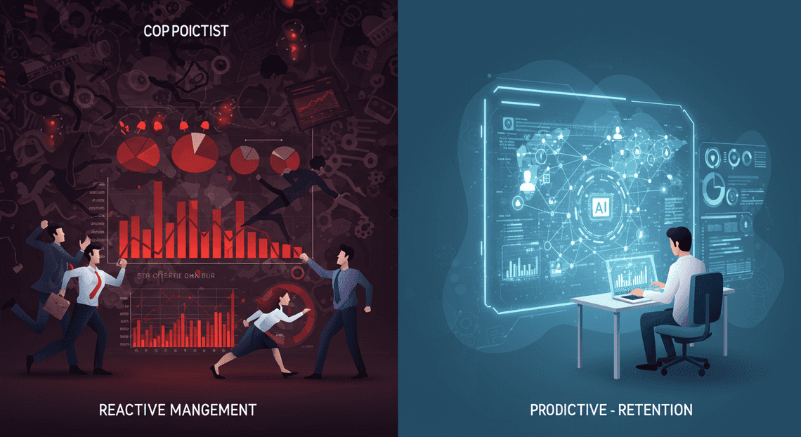
The High Cost of Reactive Churn Management
Customer churn is more than a metric on a dashboard; it’s a silent killer of growth. The oft-quoted statistic that acquiring a new customer costs 5 to 25 times more than retaining an existing one only scratches the surface. The true cost of churn is a cascade of negative consequences: lost recurring revenue, squandered customer acquisition costs (CAC), damage to brand reputation through negative word-of-mouth, and a demoralized customer success team constantly fighting fires.
For too long, businesses have been stuck in a reactive loop. A customer complains, a payment fails, an account goes dormant—and only then does the frantic scramble to save the account begin. This isn’t a strategy; it’s a desperate, last-ditch effort. In today’s hyper-competitive subscription economy, this reactive stance is a surefire path to falling behind.
Why traditional churn indicators are no longer enough
The classic red flags for churn are lagging indicators. They tell you about a problem that has already metastasized. Consider these common signals:
-
A spike in support tickets: The customer is already frustrated.
-
A direct cancellation threat: The decision to leave has likely already been made.
-
A sudden, drastic drop in product usage: The user has already disengaged and is probably evaluating alternatives.
By the time these alarms sound, you’re playing defense with the clock running out. The customer has already mentally churned, and any intervention you make is an uphill battle against established dissatisfaction.
The more insidious threat is “silent churn.” These are the customers who don’t complain. They don’t cause a fuss. They simply fade away. Their usage dwindles slowly, they stop adopting new features, and one day, they fail to renew. Traditional monitoring, which looks for dramatic events, misses these customers entirely. The signals of their departure are subtle, hidden in complex behavioral patterns that simple heuristics and dashboards can’t detect.
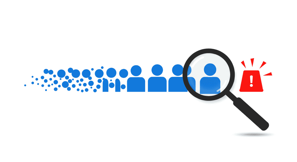
The competitive advantage of proactive, data-driven retention
The alternative to this reactive firefighting is a proactive, predictive approach. The goal is to shift from asking “Who has left?” to “Who is likely to leave, and why?” This is where the synthesis of cloud data warehousing and machine learning becomes a powerful competitive weapon.
By leveraging a centralized data platform like BigQuery to consolidate every customer touchpoint—product analytics, support interactions, billing history, marketing engagement—we can train ML models on [Building Self Correcting Agentic Workflows with Building Self-Correcting Agentic Workflows with Vertex AI](https://votuduc.com/building-self-correcting-agentic-workflows-with-vertex-ai-p-20260321542526) to uncover the hidden correlations that precede churn. These models don’t just look for a single smoking gun; they identify complex, multi-faceted patterns:
-
A slight decrease in the adoption rate of “sticky” features over a 90-day period.
-
A shift in user personas interacting with the platform, indicating a key champion may have left the organization.
-
A correlation between negative sentiment in support tickets and a subsequent decline in a specific feature’s usage.
Armed with these predictive insights, a business can fundamentally change its retention strategy. Instead of broad, generic win-back campaigns, Customer Success Managers (CSMs) can execute highly targeted, personalized interventions precisely when they will have the most impact. This is the advantage: focusing your most valuable resource—the time and expertise of your CSMs—on the right customers, at the right time, with the right message. It transforms retention from a cost center into a strategic driver of growth and product improvement.
Our goal: An automated agent to empower CSMs
This blueprint isn’t about building a monolithic, black-box model that simply flags an account as “high risk.” Actionability is key. A label without context is just more noise.
Our objective is to construct an intelligent, automated agent that serves as a co-pilot for your Customer Success team. This system, built on BigQuery and Vertex AI, will not only predict the probability of churn but also provide the reasons behind the prediction. Imagine a system that doesn’t just say “Customer X has an 85% churn risk.” Instead, it says:
“Customer X’s churn risk has increased to 85% because their usage of the Reporting API has declined by 40% in the last 30 days, and they have not logged in to view the new dashboard features we announced two weeks ago. Accounts with similar patterns have churned within 60 days.”
This is the level of insight that empowers a CSM to move from being a reactive problem-solver to a proactive, strategic advisor. The system can automatically create a prioritized task in their CRM, suggest specific talking points for their next call, and provide the data-backed evidence they need to have a meaningful conversation. This is our goal: to transform raw data into automated, explainable intelligence that empowers humans to build better, longer-lasting customer relationships.
Architecting the Predictive Churn Agent on Google Cloud
To construct a system that doesn’t just predict churn but actively works to prevent it, we move beyond simple scripts and isolated models. We architect an intelligent, autonomous agent. The blueprint for this agent on Google Cloud is built on a foundation of serverless, managed services, creating a cognitive architecture that is both powerful and profoundly efficient. It’s a system designed to ingest signals, derive intelligence, and trigger actions with minimal human friction.
Core components: BigQuery for data warehousing, Vertex AI for forecasting
At the heart of our architecture lie two foundational pillars of Google’s data and AI stack. They are not merely tools; they are the memory and the cerebrum of our predictive agent.
BigQuery: The Central Nervous System
Think of BigQuery not as a database, but as the agent’s long-term memory and central nervous system. It’s the unified repository where all relevant signals converge.
-
Infinite Scalability: We pipe raw [Automatically create new folders in Google Drive, generate templates in new folders, fill out text automatically in new files, and save info in [Automated Web Scraping with [Multilingual Text-to-Speech Tool with SocialSheet Streamline Your Social Media Posting 123](https://votuduc.com/Multilingual-Text-to-Speech-Tool-with-Google-Workspace-p809282)](https://votuduc.com/Automated-Web-Scraping-with-Google-Sheets-p292968)](https://workspace.google.com/marketplace/app/auto_create_folder_and_files/430076014869) usage logs, CRM data, subscription details, and support ticket information directly into BigQuery. Its serverless nature means we never think about capacity planning. Whether we’re analyzing gigabytes or petabytes, the performance scales transparently.
-
The Feature Store: This is where raw data is transformed into intelligence. Through scheduled SQL queries, we distill complex event streams into high-signal features: 7-day feature adoption velocity, changes in daily active users per account, time since last login, and sentiment scores from support interactions.
-
BigQuery ML (BQML): For rapid prototyping and establishing baselines, BQML is unparalleled. We can train and evaluate initial churn models using familiar SQL syntax, directly where the data lives. This drastically lowers the barrier to entry and accelerates the journey from data to insight.
Vertex AI: The Predictive Brain
If BigQuery is the memory, Vertex AI is the sophisticated cognitive engine responsible for reasoning and foresight. It’s a unified platform that orchestrates the entire machine learning lifecycle.
-
Vertex AI Pipelines: This is the [Automated Job Creation in Real Time Jobber and Google Sheets Integration from Gmail](https://votuduc.com/Automated-Job-Creation-in-Jobber-from-Gmail-p115606) engine. We define our end-to-end workflow—from data extraction and feature engineering in BigQuery to model training, evaluation, and deployment—as a codified, repeatable pipeline. Triggered on a schedule, it ensures our churn model is continuously retrained on fresh data, preventing model drift and maintaining peak accuracy.
-
Vertex AI Forecasting: We leverage Vertex AI’s purpose-built forecasting capabilities. Churn is fundamentally a time-series problem; a customer’s declining engagement over time is a powerful predictor. Vertex AI Forecasting is optimized to analyze thousands of these individual customer time-series simultaneously, capturing trends, seasonality, and complex patterns that simpler classification models might miss.
-
Model Registry & Endpoints: Once a model is trained, the Vertex AI Model Registry versions and governs it. From there, we can deploy it to a batch prediction service. This service runs on a schedule, scoring our entire customer base and identifying accounts that are exhibiting churn-like behavior.
The data pipeline: From Workspace usage to actionable alerts in Google Sheets
An architecture is only as good as the actions it enables. This pipeline is designed for a single purpose: to convert raw usage data into a prioritized worklist for the teams who can intervene.
-
Ingestion: Native Google Cloud integrations automatically export AC2F Streamline Your Google Drive Workflow audit logs (e.g., Drive activity, Meet usage, user logins) into a dedicated BigQuery dataset. This is a continuous, hands-off data stream.
-
Transformation: A scheduled BigQuery query runs daily, aggregating the raw logs into our core features table. This table has one row per customer per day, summarizing their engagement level across key metrics.
-
Prediction: A weekly Cloud Scheduler job triggers our Vertex AI Pipeline. The pipeline reads the latest feature data, retrains the forecasting model, and generates a fresh set of churn probability scores for every active customer for the next 30 days.
-
Materialization: The prediction results—customer ID, churn probability, risk tier (High, Medium, Low), and the top contributing factors for the prediction—are written back to a new results table in BigQuery.
-
Activation: A lightweight Cloud Function, triggered upon the successful completion of the Vertex AI Pipeline, executes a final, critical step. It queries the BigQuery results table for all customers flagged as “High” risk. It then uses the Google Sheets API to clear and populate a designated worksheet. This sheet becomes a dynamic, real-time dashboard for the Customer Success team, telling them exactly who to talk to and why, with no need for them to log into a complex BI tool or CRM dashboard.
Why this serverless stack is built for scalability and efficiency
Choosing a serverless, managed architecture isn’t an incidental detail; it’s a strategic decision that defines the system’s operational characteristics.
-
Elastic Scalability: This entire system scales on demand, from zero to massive. BigQuery handles data growth, Vertex AI provisions resources for training and prediction as needed, and Cloud Functions execute for mere milliseconds to deliver the final alert. There are no servers to patch, no clusters to manage, and no idle VMs burning budget. You pay only for the exact resources consumed during the pipeline’s execution.
-
Operational Efficiency: By offloading infrastructure management to Google Cloud, the data science and engineering teams can focus entirely on what creates business value: refining features, improving model accuracy, and optimizing the intervention strategy. The MLOps burden is drastically reduced because Vertex AI Pipelines, Model Registry, and managed endpoints handle the complex mechanics of deployment, versioning, and monitoring.
-
Financial Predictability: The pay-per-use model translates directly to cost efficiency. During periods of low activity, costs are minimal. As the business grows and data volumes increase, the costs scale linearly and predictably with usage. This eliminates the massive upfront capital expenditure and the risk of over-provisioning associated with traditional, VM-based architectures.
Step 1: Preparing Your Data Foundation in BigQuery
Before a single line of JSON-to-Video Automated Rendering Engine is written for a model, the battle for predictive accuracy is often won or lost in the data preparation phase. A robust, well-structured dataset is the bedrock of any successful machine learning system. For churn prediction, this means transforming raw operational data into a feature-rich, time-aware table that accurately captures the client journey. BigQuery, with its serverless architecture and powerful SQL dialect, is the ideal environment for this critical transformation.
Identifying key client usage metrics that correlate with churn
The first task is to move from raw data to meaningful signals. Churn is rarely a sudden event; it’s typically preceded by a pattern of declining engagement or negative experiences. Your goal is to translate these behavioral patterns into quantifiable metrics. This process involves a combination of domain expertise, stakeholder interviews, and exploratory data analysis (EDA).
Start by hypothesizing what behaviors distinguish a healthy, engaged client from one at risk of churning. Group these hypotheses into logical categories:
-
Product/Service Engagement: This is often the most potent source of predictive features.
-
Frequency: How often does a client log in?
(e.g., count_logins_last_30d) -
Recency: When was their last key action?
(e.g., days_since_last_report_generated) -
Intensity: What is the volume of their usage?
(e.g., avg_daily_api_calls, total_data_processed_gb) -
Breadth: How many core features are they actively using?
(e.g., distinct_feature_count_last_90d) -
Customer Health & Support Interaction: How a client interacts with your support channels can be a strong indicator of satisfaction or frustration.
-
Ticket Volume: Number of support tickets created in the last quarter.
-
Ticket Severity: Count of high-priority or blocker-level tickets.
-
Satisfaction Scores: Average CSAT or NPS scores from recent surveys.
-
Commercial & Contractual Data: These metrics provide context around the client’s financial relationship with your business.
-
Account Tenure: How long have they been a customer?
-
Contract Value: Is it a high-value or low-value account?
-
Recent Changes: Have they recently downgraded their plan or reduced their seat count?
Once you have a list of potential features, use BigQuery to perform EDA and validate their correlation with churn. For example, you can calculate the average login frequency for clients who churned versus those who did not.
Here is a simple BigQuery SQL snippet to calculate a basic engagement feature like “logins in the last 30 days” from a raw event log:
-- Assumes a table `project.dataset.user_events` with user_id, event_timestamp, event_type

SELECT

user_id,

-- The snapshot_date represents the point in time for which we are calculating features.

-- Here, we're calculating for the end of the month.

DATE_TRUNC(event_timestamp, MONTH) AS snapshot_date,

COUNT(CASE WHEN event_type = 'login' THEN 1 END) AS monthly_login_count

FROM

`project.dataset.user_events`

WHERE

event_timestamp >= '2023-01-01' -- Limit to relevant history

GROUP BY

1, 2
Structuring your dataset for time-series analysis
Churn is a time-dependent problem. A client who was highly engaged six months ago but inactive for the last 30 days is a very different case from a client with consistently moderate usage. To capture these temporal dynamics, you must structure your data as a series of chronological snapshots.
Each row in your final training dataset should represent a single client at a specific point in time (e.g., the first day of each month). All features in that row must be calculated using only data available up to that point in time. This structure prevents data leakage, where your model inadvertently learns from future information.
The ideal structure for your ML-ready table looks like this:
| client_id | snapshot_date | feature_1 | feature_2 | … | churned_in_next_period |
| :---------- | :-------------- | :---------- | :---------- | :— | :----------------------- |
| abc-123 | 2023-01-01 | 45 | 0.87 | … | 0 (False) |
| abc-123 | 2023-02-01 | 32 | 0.65 | … | 0 (False) |
| abc-123 | 2023-03-01 | 5 | 0.12 | … | 1 (True) |
| xyz-789 | 2023-01-01 | 150 | 0.95 | … | 0 (False) |
Here’s how to create this structure in BigQuery using powerful window functions. This example calculates a 90-day rolling average of API calls for each client at the beginning of each month.
-- Assumes a table `project.dataset.daily_usage` with client_id, usage_date, api_calls

WITH

MonthlySnapshots AS (

-- Generate a series of dates representing the first of each month for each client

SELECT DISTINCT

client_id,

DATE_TRUNC(usage_date, MONTH) AS snapshot_month

FROM

`project.dataset.daily_usage`

)

SELECT

s.client_id,

s.snapshot_month,

-- Calculate the average daily API calls in the 90 days PRECEDING the snapshot date

AVG(u.api_calls) OVER (

PARTITION BY s.client_id

ORDER BY s.snapshot_month

RANGE BETWEEN INTERVAL 90 DAY PRECEDING AND INTERVAL 1 DAY PRECEDING

) AS avg_api_calls_last_90d,

-- Define the target label: did the client have a 'churn' event in the following month?

-- (This requires joining with a churn events table)

MAX(CASE WHEN c.churn_date BETWEEN s.snapshot_month AND DATE_ADD(s.snapshot_month, INTERVAL 1 MONTH) THEN 1 ELSE 0 END) AS churned_in_next_month

FROM

MonthlySnapshots s

LEFT JOIN

`project.dataset.daily_usage` u ON s.client_id = u.client_id AND u.usage_date < s.snapshot_month

LEFT JOIN

`project.dataset.churn_events` c ON s.client_id = c.client_id

GROUP BY

s.client_id, s.snapshot_month, u.api_calls -- Grouping to apply window function correctly
This query structure is the core of your feature engineering pipeline. You can expand it to include dozens of features, all calculated relative to the snapshot_month.
Automating the data ingestion from source systems
A one-time data dump is insufficient for a production churn prediction system. You need a continuous, automated flow of data from your source systems into BigQuery to keep your features fresh and your predictions relevant. The Google Cloud ecosystem provides several managed services to build these data pipelines with minimal operational overhead.
The architectural pattern typically involves landing raw data into staging tables in BigQuery, then running scheduled transformation jobs to build the final ML-ready feature table.
- From Transactional Databases (e.g., PostgreSQL, MySQL):
-
Tool: Datastream
-
Method: Datastream uses Change Data Capture (CDC) to replicate changes from your source database directly into BigQuery in near real-time. This is highly efficient and avoids heavy batch loads on your production databases.
- From Event Streams (e.g., application logs, clickstreams):
-
Method: Your applications publish events to a Pub/Sub topic. A Dataflow streaming pipeline subscribes to this topic, performs any necessary micro-transformations (like parsing JSON), and streams the results directly into a BigQuery staging table.
- From Third-Party SaaS Platforms (e.g., Salesforce, Zendesk):
-
Tool: Cloud Data Fusion or third-party ELT providers (e.g., Fivetran, Airbyte).
-
Method: These tools provide pre-built connectors that handle the API authentication and data extraction logic for hundreds of common sources. You can configure a schedule to regularly sync data from these platforms into dedicated BigQuery tables.
Once the raw data is consistently landing in your BigQuery staging area, you can automate the final transformation step. Use BigQuery scheduled queries to run your time-series feature engineering SQL (like the window function example above) on a recurring basis (e.g., daily or weekly). This scheduled query will update your final ML_FEATURE_TABLE, ensuring your Vertex AI models always have access to the latest data for both training and prediction.
Step 2: Building the Forecasting Model with Vertex AI
With our time-series data prepped and ready in BigQuery, we can now move to the core of our solution: building the predictive model. This is where Vertex AI truly shines, abstracting away the immense complexity of machine learning and allowing us to focus on the business problem. We’ll leverage Vertex AI’s AutoML capabilities to train a sophisticated forecasting model without writing a single line of Python or SQL for the model-building process itself.
A practical overview of Vertex AI Forecasting for business users
Before we dive into the clicks and configurations, let’s demystify what Vertex AI Forecasting is. At its heart, it’s a managed service on Google Cloud designed to take your historical time-series data and produce high-quality predictions about the future.
Think of it as an expert data scientist in a box. You provide the clean data, define your goal (e.g., “predict daily churn for the next 30 days”), and Vertex AI handles the rest. This includes:
-
Automated Feature Engineering: It intelligently analyzes your input data (like user engagement scores, marketing spend, or seasonality) and engineers features that help the model understand trends and patterns.
-
Algorithm Selection: Vertex AI has a powerful ensemble of forecasting models under the hood, including classics like ARIMA+ and advanced deep learning models like Google’s own Temporal Fusion Transformer. It automatically tests these models and selects the one that performs best on your specific dataset.
-
Hyperparameter Tuning: It fine-tunes the hundreds of settings for the chosen algorithm to squeeze out the best possible performance.
-
Managed Infrastructure: You don’t need to worry about provisioning servers, managing compute clusters, or scaling resources. Vertex AI handles all the infrastructure heavy lifting, allowing you to train models on massive datasets that would cripple a local machine.
For our churn prediction use case, we’re not just asking “who will churn?” but rather “how many users, and with what characteristics, will churn over the next X days?” This shift from a classification problem to a forecasting problem provides a more strategic, forward-looking view that’s invaluable for resource planning, marketing campaign timing, and financial forecasting.
Configuring and training your time-series model without writing ML code
Let’s walk through the process of creating and training our churn forecasting model using the Google Cloud Console. The beauty of this approach is its accessibility; you’re essentially guiding the AI, not coding it.
1. Navigate to the Vertex AI Workbench
In the Google Cloud Console, navigate to the Vertex AI section. In the left-hand menu, find “Models” and then proceed to the training section to create a new training job.
2. Create a New Dataset
First, we need to tell Vertex AI where to find our data.
-
Create a new Training Pipeline: Click the “Create” button to start the process.
-
Select the Objective: For the model objective, choose Forecasting.
-
Define the Dataset:
-
Give your dataset a descriptive name, like
churn_daily_forecasting_data.
For the data source, select* “Select a table or view from BigQuery”**.
- Browse to the BigQuery table we created in the previous step (e.g.,
your-project.your_dataset.daily_churn_features).
Vertex AI will then ingest and analyze the schema of your table.
3. Configure the Training Job
This is the most critical step, where you define the specifics of your forecasting task.
-
Training Method: Select AutoML. This confirms we want Vertex AI to handle the model selection and tuning.
-
Target Column: This is what you want to predict. From the dropdown, select the column representing the number of churned users, for example,
churn_count. -
Time Series Identifier Column: This column defines the individual series you want to forecast. If you’re forecasting churn for different customer segments, you would select your
customer_segmentcolumn here. If you’re only forecasting total churn, you can leave this blank. For maximum insight, let’s assume we’re usingcustomer_segment. -
Time Column: Specify the column that contains the timestamp for each data point. This will be our
event_datecolumn. -
Data Granularity: Define the frequency of your data points (e.g., Daily, Weekly). We’ll select Daily.
-
Forecast Horizon: How far into the future do you want to predict? A common value for churn is
30or90days. This tells the model to generate predictions for the next 30 or 90 periods after the end of the training data. -
Context Window: How much historical data should the model consider when making a prediction for a future point? A good starting point is often equal to your forecast horizon. If you’re predicting 30 days out, a context window of 30-90 days can be effective. This helps the model capture recent trends.
-
Budget: Define the maximum compute hours (node hours) for training. For most datasets, 1-3 node hours is a great starting point. Vertex AI will automatically stop training once it finds a good model or the budget is reached.
Once everything is configured, click “Start Training”. Now, you can grab a coffee. Vertex AI is spinning up resources, preprocessing your data, and running its automated machine learning pipeline. This process can take anywhere from 30 minutes to several hours, depending on your dataset size and training budget.
Interpreting model results and understanding prediction accuracy
Once training is complete, Vertex AI provides a rich interface to evaluate your model’s performance and understand its predictions. This is crucial for building trust in the model before deploying it.
1. Reviewing Evaluation Metrics
In the model’s “Evaluate” tab, you’ll find a set of standard forecasting metrics. Here are the key ones to focus on:
-
MAPE (Mean Absolute Percentage Error): This is the most intuitive metric for business stakeholders. A MAPE of 0.10 means that, on average, the model’s forecast is off by 10%. For churn prediction, a MAPE under 15-20% is often considered very good.
-
RMSE (Root Mean Squared Error): This tells you the typical error in terms of the actual number of churned users. If your RMSE is 5.5, it means your predictions are typically off by about 5 or 6 users per day. It heavily penalizes large errors, making it a good indicator of forecast reliability.
-
Quantiles: Vertex AI doesn’t just give you a single prediction; it provides a probabilistic forecast with different quantiles (e.g., p10, p50, p90).
The* p50** forecast is the median, or most likely, outcome.
The* p90** forecast is a “pessimistic” scenario where churn is higher than expected. This is useful for worst-case scenario planning.
The* p10** forecast is an “optimistic” scenario.
2. Analyzing Feature Importance
Perhaps the most powerful feature for gaining insights is Feature Attribution. This dashboard shows you which of your input features had the most significant impact on the forecast.
For example, you might discover that:
- The
days_since_last_purchasefeature has the highest attribution, confirming that inactivity is a strong predictor of churn.
A recent marketing_campaign_flag had a negative attribution, meaning it helped reduce* the predicted churn.
- The
customer_support_ticketsfeature has a high positive impact, providing quantitative evidence that poor service experiences lead to churn.
These insights are gold. They transform the model from a black box into a strategic tool that validates business hypotheses and uncovers new drivers of customer behavior.
3. Visualizing the Forecast
Finally, Vertex AI generates interactive plots showing your historical data, the model’s predictions on the test set (backtesting), and the actual forecast into the future. This visual check is essential. You can see how well the model captured past seasonality and trends and visually inspect the future forecast, complete with its uncertainty interval (the shaded area around the prediction). This makes it easy to communicate the model’s output to anyone in the organization, regardless of their technical background.
Step 3: Delivering Actionable Insights to the Front Lines
A predictive model is only valuable when its predictions drive action. A churn score sitting in a BigQuery table helps no one. The crucial final step in our blueprint is to bridge the gap between our machine learning pipeline and the business users who can intervene—the Customer Success Managers (CSMs). This process, often called “operationalizing ML,” involves exporting the data, creating an automated notification system, and presenting the insights in a clear, prioritized, and actionable format.
Exporting churn-risk scores from Vertex AI
The output of our Vertex AI batch prediction job is the raw material for our entire operational workflow. The goal is to have a clean, accessible, and consistently updated source of truth for customer churn risk. BigQuery is the ideal destination for these predictions.
When you configure a batch prediction job in Vertex AI, you specify an output destination. By selecting BigQuery, you instruct Vertex AI to write the results directly into a table. Each time the prediction job runs (e.g., nightly), it appends new predictions to this table.
A well-structured output table should contain, at a minimum:
-
customer_id: The unique identifier for the customer. -
prediction_timestamp: The exact time the prediction was generated. This is critical for tracking score changes over time. -
predicted_churn_probability: The model’s output score, typically a float between 0 and 1. -
explainability_attributions(Optional but highly recommended): If you enabled Vertex Explainable AI, this column (often aSTRUCTorJSONtype) contains the features that most influenced the prediction.
Your resulting BigQuery table, let’s call it churn_predictions, would look something like this after a few runs:
| customer_id | prediction_timestamp | predicted_churn_probability |
|-------------|---------------------------|-----------------------------|
| 48151 | 2023-10-27 02:00:00 UTC | 0.823 |
| 62342 | 2023-10-27 02:00:00 UTC | 0.115 |
| 48151 | 2023-10-26 02:00:00 UTC | 0.751 |
| … | … | … |
With our predictions landing reliably in BigQuery, we can now build a system to pull this data and deliver it to our end-users.
Using [AI Powered Cover Letter Automated Quote Generation and Delivery System for Jobber Engine](https://votuduc.com/AI-Powered-Cover-Letter-Automated Work Order Processing for UPS-Engine-p111092) to create an automated alert system in Sheets
While data professionals are comfortable in BigQuery, CSMs live in tools like Salesforce, Zendesk, and, very often, Google Sheets. We can meet them where they are by using Genesis Engine AI Powered Content to Video Production Pipeline to create a lightweight, yet powerful, automation that pushes high-risk alerts directly into a shared spreadsheet.
[Architecting Multi Tenant AI Workflows in Building Modular Agentic Apps Script with Gemini Function Calling](https://votuduc.com/architecting-multi-tenant-ai-workflows-in-google-apps-script-p-20260321290501) is a JavaScript-based platform that lets you extend and automate Automated Client Onboarding with Google Forms and Google Drive. applications. We’ll use it to connect to BigQuery, run a query for the latest high-risk customers, and write the results to a Google Sheet.
The Workflow:
-
Create a Google Sheet: This will be the CSM dashboard.
-
Open the Script Editor: In the Sheet, go to
Extensions > Apps Script. -
Enable the BigQuery API: In the script editor, click
Services +and add the “BigQuery API” advanced service. -
Write the Script: The script will perform three main tasks:
-
Define a query to find new high-risk customers.
-
Execute the query against your BigQuery predictions table.
-
Clear the relevant sheet and write the new data.
- Set a Trigger: Schedule the script to run automatically (e.g., every morning at 8 AM) using a time-driven trigger.
Here is a sample Apps Script code snippet that illustrates the core logic:
// The ID of your Google Cloud Project

const GCP_PROJECT_ID = 'your-gcp-project-id';

// The ID of the Google Sheet this script is bound to

const SPREADSHEET_ID = 'your-spreadsheet-id';

/**

* Main function to fetch high-risk customers from BigQuery and populate the sheet.

* This function can be triggered to run on a daily schedule.

*/

function refreshHighRiskCustomerList() {

const sheet = SpreadsheetApp.openById(SPREADSHEET_ID).getSheetByName('High-Risk Customers');

// 1. Define the BigQuery SQL Query

// This query gets the LATEST prediction for each customer and filters for those

// with a churn probability greater than 0.75.

const sqlQuery = `

WITH LatestPredictions AS (

SELECT

customer_id,

predicted_churn_probability,

ROW_NUMBER() OVER(PARTITION BY customer_id ORDER BY prediction_timestamp DESC) as rn

FROM

\`your-gcp-project-id.your_dataset.churn_predictions\`

)

SELECT

c.customer_name, -- Assumes you have a customer details table to join

lp.customer_id,

lp.predicted_churn_probability

FROM

LatestPredictions lp

JOIN

\`your-gcp-project-id.your_dataset.customer_details\` c ON lp.customer_id = c.id

WHERE

rn = 1 AND lp.predicted_churn_probability > 0.75

ORDER BY

lp.predicted_churn_probability DESC

`;

// 2. Execute the Query

try {

const request = { query: sqlQuery, useLegacySql: false };

const queryResults = BigQuery.Jobs.query(request, GCP_PROJECT_ID);

const jobId = queryResults.jobReference.jobId;

// Wait for the query to finish

let sleepTimeMs = 500;

while (!queryResults.jobComplete) {

Utilities.sleep(sleepTimeMs);

sleepTimeMs *= 2;

queryResults = BigQuery.Jobs.getQueryResults(GCP_PROJECT_ID, jobId);

}

// 3. Process and Write Results to the Sheet

const rows = queryResults.rows;

if (rows) {

const headers = queryResults.schema.fields.map(field => field.name);

const data = rows.map(row => row.f.map(cell => cell.v));

// Clear previous data and write new data

sheet.getRange(2, 1, sheet.getLastRow(), sheet.getLastColumn()).clearContent();

sheet.getRange(1, 1, 1, headers.length).setValues([headers]);

sheet.getRange(2, 1, data.length, data[0].length).setValues(data);

Logger.log('Successfully updated sheet with %s high-risk customers.', data.length);

} else {

Logger.log('No high-risk customers found.');

sheet.getRange(2, 1, sheet.getLastRow(), 1).clearContent(); // Clear old data if none found

}

} catch (err) {

Logger.log('Error refreshing customer list: %s', err.message);

}

}
This script automates the data flow, ensuring the CSM team always has a fresh, prioritized list to work from without ever needing to write a line of SQL.
Designing a CSM-friendly dashboard to prioritize outreach
The final piece is presentation. A raw data export is not a dashboard. We need to design the Google Sheet to be instantly understandable and guide the CSM’s daily workflow. The goal is to answer three questions for the CSM at a glance: Who should I contact? Why are they at risk? What should I do next?
Here’s a blueprint for an effective CSM dashboard in Google Sheets:
Sheet Name: High-Risk Customers
| Customer Name (Link to CRM) | Churn Score | Score Trend (7d) | Key Risk Drivers | Last Contact | Assigned CSM | Status / Notes |
| :--- | :--- | :--- | :--- | :--- | :--- | :--- |
| Global Tech Inc. | 89% | 📈 (75% -> 89%) | support_tickets_opened, usage_metric_A_down | 25 days ago | Alice | Scheduled QBR for next week |
| Innovate Solutions | 82% | 📉 (85% -> 82%) | feature_X_adoption_low, login_frequency_down | 5 days ago | Bob | Reached out, no response yet |
| Data Corp | 76% | ➡️ (76% -> 76%) | contract_renewal_approaching | 40 days ago | Alice | Needs immediate follow-up |
Key Design Elements:
-
Prioritization: The list is automatically sorted by
Churn Scorein descending order by the Apps Script query. The most critical customer is always at the top. -
Visual Cues: Use conditional formatting on the
Churn Scorecolumn (e.g., dark red for >85%, red for >75%) to make risk levels pop. -
Context is King (Score Trend): Don’t just show the current score. Show its recent trajectory. A customer who jumped from 40% to 80% is more alarming than one who has been sitting at 81% for weeks. This can be calculated in BigQuery or with Apps Script by looking at historical predictions. A simple
SPARKLINEfunction in Sheets can also visualize this. -
**Actionable “Why” (Key Risk Drivers): This is where Explainable AI becomes a superpower. Instead of just a score, you provide the reason. The Apps Script can parse the explainability output and list the top 2-3 features contributing to the score. This transforms the conversation from “Our model says you might churn” to “I noticed your team’s usage of our reporting feature has declined, and you’ve opened a few support tickets. Is there anything we can help with?”
-
Workflow Integration (Link to CRM): The customer’s name should be a hyperlink that takes the CSM directly to the customer’s record in your CRM (e.g., Salesforce). This minimizes friction and context-switching.
-
Accountability and Collaboration: Columns like
Assigned CSMand a free-textStatus / Notesfield allow the team to track outreach efforts and collaborate directly within the dashboard.
By transforming raw predictions into a prioritized, context-rich, and integrated dashboard, you close the loop. The insights generated by your sophisticated ML model are now seamlessly embedded in the daily workflow of the people who can use them to make a tangible impact on retaining customers.
From Prediction to Prevention: Scaling Your Architecture
Building an accurate churn prediction model is a significant technical achievement, but it’s only half the battle. A model sitting idle in a project is a cost center; a model integrated into your business processes is a revenue generator. The true value is unlocked when you move from passive prediction to proactive prevention. This requires a robust, scalable architecture that not only serves predictions but also triggers actions and measures their impact.
Let’s explore the critical components of operationalizing your churn model, transforming raw probability scores into tangible business outcomes and ensuring your system is built for growth.
Translating risk scores into effective intervention strategies
A churn score—say, 0.87—is a powerful signal, but it’s not a strategy. The crucial next step is to translate this number into a specific, timely, and relevant action. A one-size-fits-all approach to intervention is inefficient and can even be counterproductive. The key is to build a system of segmented and personalized interventions.
1. Strategic Customer Segmentation:
First, stratify your users based on their predicted churn risk. A simple but effective approach is to create tiered segments directly in BigQuery:
-
High-Risk (e.g., Score > 0.75): These users are on the verge of leaving. They require immediate, high-touch interventions.
-
Medium-Risk (e.g., Score 0.40 - 0.75): These users are disengaged or “on the fence.” They are prime candidates for automated, value-driven re-engagement campaigns.
-
Low-Risk (e.g., Score < 0.40): These are your happy, active users. The goal here is to avoid “intervention fatigue” or, worse, offering discounts to customers who would have happily paid full price. Nurturing them with standard product updates and community engagement is often sufficient.
2. Mapping Interventions to Segments and Causes:
With segments defined, you can map specific actions to each. Crucially, your intervention strategy should be informed not just by the score but by the reasons behind it. This is where Vertex AI Explainable AI becomes invaluable. By analyzing feature attributions, you can understand why a user is at risk.
-
For High-Risk Users:
-
Cause: Low usage of a key feature. Intervention: Trigger a task in your CRM (e.g., Salesforce, HubSpot) for a Customer Success Manager to schedule a personalized 1:1 training session.
-
Cause: Recent support ticket with negative sentiment. Intervention: Escalate to a senior support specialist for a proactive follow-up call and offer a service credit.
-
For Medium-Risk Users:
-
Cause: Drop-off in session frequency. Intervention: Add the user to an automated email campaign in your marketing platform (e.g., Braze, Marketo) highlighting new, relevant features or a “we miss you” offer.
-
Cause: Stagnant project or unused credits. Intervention: Send a targeted in-app notification with a helpful tip or a reminder of their remaining balance.
3. The Technical Integration:
This is where the “automation” in our blueprint comes to life. Your BigQuery table of predictions becomes the source of truth. You can use a scheduled query or a tool like Cloud Composer to periodically check for users whose risk segment has changed. When a change is detected, trigger a Cloud Function that pushes the relevant data (user ID, risk score, key churn drivers) to the appropriate downstream system via its API—be it your CRM, marketing platform, or customer support tool.
Measuring the ROI of your predictive churn model
How do you prove this complex system is worth the engineering effort and cloud spend? By rigorously measuring its Return on Investment (ROI). Intuition isn’t enough; you need data to justify the program’s existence and guide its evolution.
The gold standard for measurement is A/B testing. For any intervention strategy you deploy, you must maintain a control group.
1. Implementing a Controlled Experiment:
Within each risk segment you target, randomly hold back a small portion of users (e.g., 10-20%) who will not receive the intervention. This is your control group. The remaining users form the treatment group.
-
Treatment Group: High-risk users who receive the CSM call.
-
Control Group: High-risk users who receive no special intervention.
2. Calculating the Lift and Financial Impact:
After a defined period (e.g., 30-60 days), you compare the actual churn rate between the two groups.
-
Churn Rate (Control): 25%
-
Churn Rate (Treatment): 15%
-
Lift: 10 percentage points. You have successfully prevented 10% of the at-risk cohort from churning.
Now, you can translate this into a financial figure.
-
Customers Saved: (Size of Treatment Group) * 10%
-
Gross Gain: (Customers Saved) * Average Customer Lifetime Value (CLV)
3. The Complete ROI Formula:
A true ROI calculation must account for all associated costs.
-
Gains: The Gross Gain calculated above.
-
Costs:
-
Intervention Costs: The cost of discounts offered, the hourly cost of the CSMs’ time, etc.
-
Platform Costs: Vertex AI model training and prediction costs, BigQuery storage and query fees, Cloud Functions invocations.
-
Human Costs: The salaries of the data scientists, ML engineers, and data analysts maintaining the system.
The formula is simple: ROI = (Gains - Costs) / Costs
This continuous measurement loop is vital. It allows you to confidently double down on high-ROI strategies and quickly pivot away from interventions that are ineffective or too costly.
Ready to scale? Book a GDE discovery call for a custom audit
You’ve built the proof-of-concept. You’ve demonstrated value with a positive ROI. Now, you need to scale. Scaling an ML system introduces new challenges: optimizing cloud costs, ensuring low-latency predictions, maintaining data quality pipelines, and integrating with a growing web of enterprise systems.
Navigating this complexity requires deep, specialized expertise. A custom architectural audit can be the difference between a system that scales gracefully and one that accumulates technical debt.
Our team, which includes Google Developer Experts (GDEs) in Cloud and Machine Learning, specializes in this. A discovery call is a no-obligation opportunity to:
-
Review Your Current Architecture: We’ll discuss your existing Vertex AI and BigQuery setup, identifying potential bottlenecks and areas for optimization.
-
Align with Business Goals: We’ll help you map your long-term business objectives to a scalable technical roadmap.
-
Identify Quick Wins: We can often spot immediate opportunities for cost savings and performance improvements.
Don’t let architectural hurdles slow down your growth. [Link: Book a complimentary discovery call today] and let our experts provide a clear, actionable blueprint for scaling your churn prevention engine.


Stop Doing Manual Work. Scale with AI.
Want to turn these blog concepts into production-ready reality for your team?
Table Of Contents
Portfolios
Related Posts
Quick Links
Legal Stuff